using gembox spreadsheet, I created a blank chart, hiding the sheet cells.
I wish I could insert values in the chart through a list of object without having to insert values in cells.
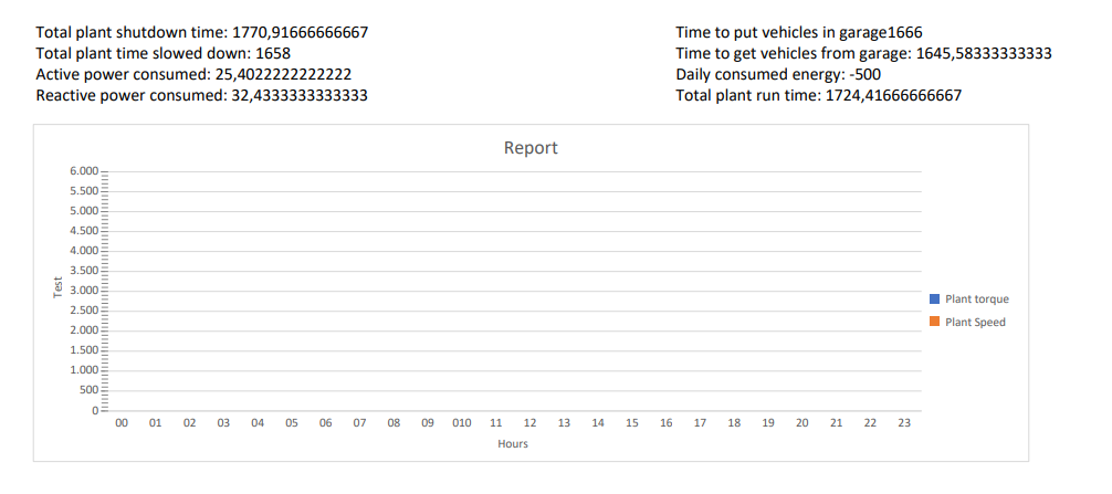
I’m supposed to input time-based data on a 24-hour basis.
How can I differentiate in order to enter the right value in correspondence of the time to which it is tied?
And if a time such as 12 noon had more than one value how could I do?
Basically, you just need to change where the data is written.
So, those values that you would usually write into the cells, you now need to provide them to Series.Add method.
Anyway, can you create an Excel file with the desired chart and I’ll let you know what Series.Add method calls you’ll need to recreate those charts?
I’m a bit confused about what column chart you’re trying to make.
Can you please create manually (with Microsoft Excel) your desired chart and send it to us?
I’ll investigate it and show you how to create that same chart without referencing cells with it.
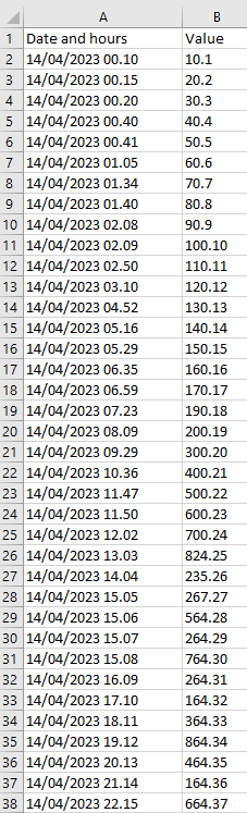
In the previous answers, I put the Excel where there are dates and values.
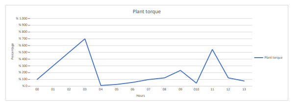
The chart represents the values over 24 hours for that day (even if only 13 hours are represented in the chart).
My question is: how can I represent on the chart several values at the same time, such as:
14/04/2023 02:08
14/04/2023 02:18
14/04/2023 02:50
There are 3 values for 2 am time.
but in my context, I will have a list of objects with the date and value inside.
The code:
// List of objects with dates (hours) and values to be inserted in the chart.
// Represented in the image of the sheet excel of the 2 preceding answers
result = con.Query<objectWithDateAndValue>(plantTorque).ToList();

var plantTorqueChart = worksheet.Charts.Add<LineChart>(ChartGrouping.Clustered, "B15", "O32");

plantTorqueChart.Legend.IsVisible = true;
plantTorqueChart.Legend.Position = ChartLegendPosition.Right;

plantTorqueChart.Title.Text = "Plant torque";
plantTorqueChart.Axes.Horizontal.Title.Text = "Hours";
plantTorqueChart.Axes.Vertical.Title.Text = "Percentage";

plantTorqueChart.SetCategoryLabels("00", "01", "02", "03", "04", "05", "06", "07", "08", "09", "010", "11", "12", "13", "14", "15", "16", "17", "18", "19", "20", "21", "22", "23", "24");

var red = DrawingColor.FromName(DrawingColorName.Red);
plantTorqueChart.Fill.SetSolid(red);
plantTorqueChart.Series[0].Fill.SetSolid(red);

var valueAxis = plantTorqueChart.Axes.VerticalValue;
valueAxis.NumberFormat = "\"% \"#,##0";
valueAxis.Minimum = 0;
valueAxis.Maximum = 1000;
valueAxis.MajorUnit = 100;
valueAxis.MinorUnit = 100;
valueAxis.MajorGridlines.IsVisible = true;
valueAxis.MinorGridlines.IsVisible = true;
valueAxis.MajorTickMarkType = TickMarkType.Outside;
valueAxis.MinorTickMarkType = TickMarkType.Cross;

// Make the entire sheet print horizontally centered on a single page with headings and gridlines.
var printOptions = worksheet.PrintOptions;
printOptions.HorizontalCentered = false;
printOptions.PrintHeadings = false;
printOptions.PrintGridlines = false;
printOptions.FitWorksheetWidthToPages = 1;
printOptions.FitWorksheetHeightToPages = 1;
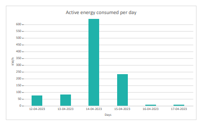
You cannot represent such data with a column chart.
That is why I wanted to check exactly what you’re doing when you are creating an Excel file manually.
Anyway, I believe what you should be looking for is an XY chart (scatter chart).
It would probably be better to first try creating the chart that you want using Microsoft Excel. Then when you have figured out how you want to represent your data you can move on to writing that out via the C# code.