Create a chart to show values from the last 24 hours

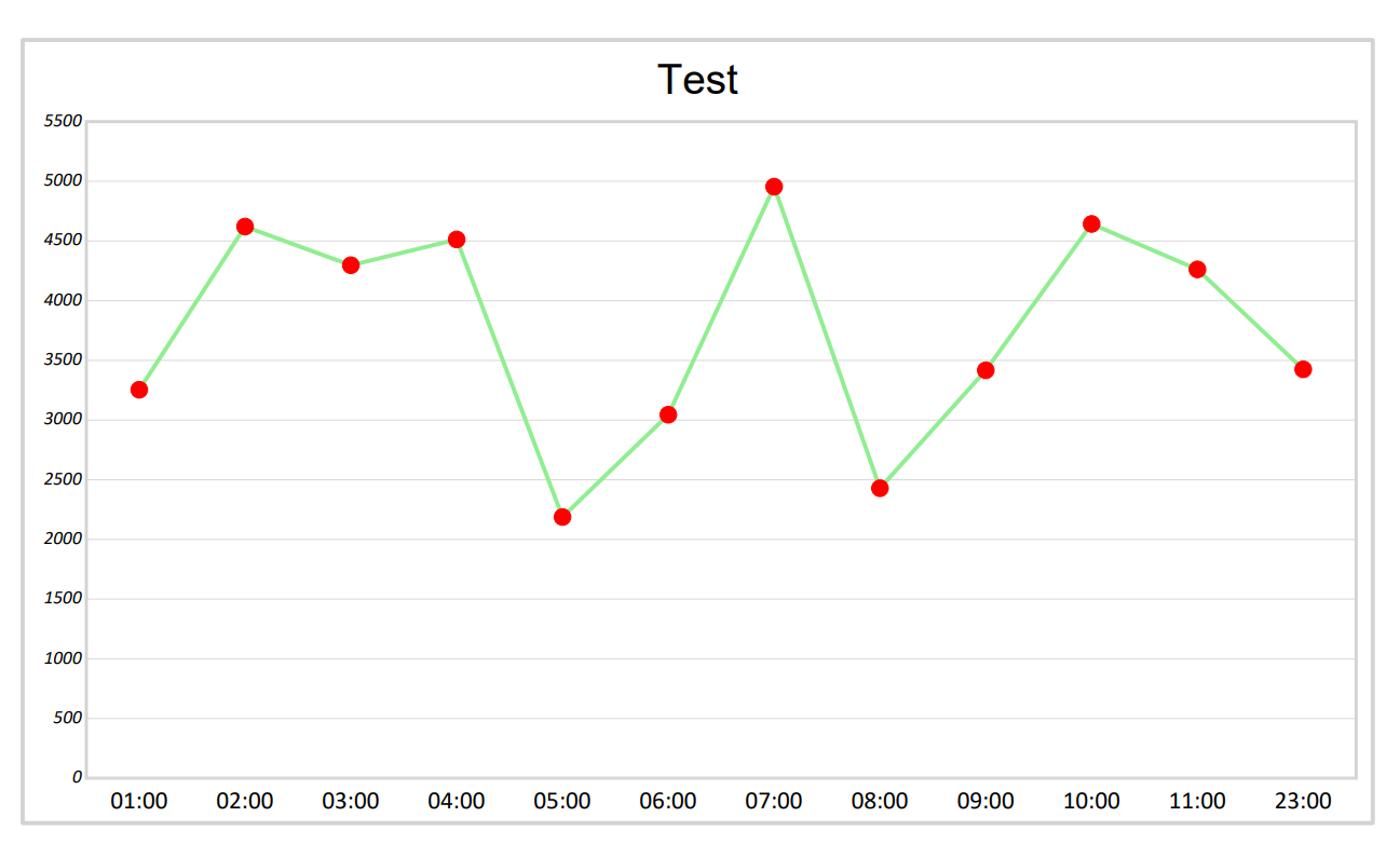
I should create a chart where the values of the last 24 hours are displayed, the data will be taken from the database, each value has an associated datetime, based on the time of the datetime will be inserted in the time zone defined in the chart.
What kind of chart should I use?
Is it possible to do this with a linear chart ?

Example:

Thanks
Yuza

Hi Yuza,

I believe that your screenshot is showing a line chart, but note that those red dots (the data points) are values in predefined time.

However, I believe that you have data that is coming in pairs (a number value + a datetime value) so what you need is an XY chart (scatter chart):

Regards,
Mario

Grace for the immediate response,
Would it be possible to add lines in the scatter chart?

Yes, like this:

scatter-chart-line

I’m creating the graph entirely from code, with console application.
I have created a dictionary containing the datetime and the values to insert in the chart.
For the example:
Hour Value
00:02 1234
00:05 1424
00:10 432
00:10 356
00:45 1356
01:30 1674
01:55 512
02:20 2674
03:40 3456
04:30 2567
05:40 5678,89
06:20 2456
07:10 1289
07:50 879
08:35 568
09:45 868
10:35 765
12:35 2765
13:35 2123

And this is my scatter chart:

Why are the different times not displayed in the Y axis?
How can I add the line in the chart?

This is my code:

//Dictionary with hour and values
var data = planDataValue.PlantTorqueValue;

worksheet.Cells[“A1”].Value = “Hour”;
worksheet.Cells[“B1”].Value = “Value”;
var rowIndex = 2;
foreach (var entry in data)
{
worksheet.Cells[$“A{rowIndex}”].Value = entry.Key.ToString(“HH:mm”);
worksheet.Cells[$“B{rowIndex}”].Value = entry.Value;
rowIndex++;
}

var scatterChart = worksheet.Charts.Add(ChartType.Scatter, “A60”, “H80”);
scatterChart.SelectData(worksheet.Cells.GetSubrange(“A1:B” + (rowIndex - 1)), true);

// Imposta il titolo dell’asse Y come “Ora”
scatterChart.Title.Text = “Value”;

Thanks
Yuza

Hi Yuza,

What type of object is the entry.Key in this line of code:

worksheet.Cells[$"A{rowIndex}"].Value = entry.Key.ToString("HH:mm");

If that is a TimeSpan value, then try using this method to set the ExcelCell value:

public static void SetValue(ExcelCell cell, TimeSpan span, string format)
{
    DateTime start = cell.Worksheet.Parent.Use1904DateSystem ?
        new DateTime(1904, 1, 1) :
        new DateTime(1899, 12, 30);

    DateTime date = start.Add(span);
    DateTime leapYearBug = new DateTime(1900, 3, 1);

    if (date < leapYearBug)
        date = date.AddDays(1);

    cell.SetValue(date);
    cell.Style.NumberFormat = format;
}

You would use it like this:

SetValue(worksheet.Cells[$"A{rowIndex}"], entry.Key, "HH:mm");

Now regarding the missing times, check that your axis is visible, for example:

var scatterChart = (ScatterChart)worksheet.Charts.Add(ChartType.Scatter, "A60", "H80");
scatterChart.SelectData(worksheet.Cells.GetSubrange("A1:B" + (rowIndex - 1)), true);

scatterChart.Axes.Horizontal.IsVisible = true;

I hope this helps.

Regards,
Mario

Is it possible to show only hours such as “01:00”, “02:00”, “03:00” instead of the exact time as 01:30, 01:55, 02:03?
And enter the values according to the time slot.

Thanks
Yuza

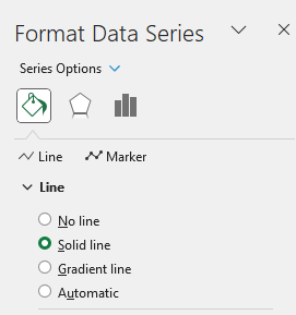
After you set those cells to DateTime values (not to String values), you should get the horizontal axis as the value axis. In that case, you’ll be able to use this:

scatterChart.Axes.HorizontalValue.MajorUnit = 1.0 / 24;

Thanks for previous answers.
I used your SetValue() function and this is the result:
"entry.Key" is a datetime and i converted to timespan

Code:
string format = “h\:mm”;
CultureInfo culture = CultureInfo.CurrentCulture;
foreach (var entry in data)
{
var timeSpan = TimeSpan.ParseExact(entry.Key.ToString(“HH:mm”), format, culture,
TimeSpanStyles.None);
SetValue(worksheet.Cells[$“A{rowIndex}”], timeSpan, “HH:mm”);
worksheet.Cells[$“B{rowIndex}”].Value = entry.Value;
rowIndex++;
}
var scatterChart = worksheet.Charts.Add(“A60”, “H80”);
scatterChart.SelectData(worksheet.Cells.GetSubrange(“A1:B” + (rowIndex - 1)), true);
scatterChart.Axes.Horizontal.IsVisible = true;

I don’t understand why all those numbers come out instead of the hours.
SetValue() correctly prints times in cells

Thank
Yuza

Hi Yuza,

Please send us your Excel file so that we can investigate it.

Regards,
Mario

Sorry mario, i was wrong.
At the end of the code I convert the file to .pdf with:
workbook.Save(path, GemBox.Spreadsheet.PdfSaveOptions.PdfDefault)
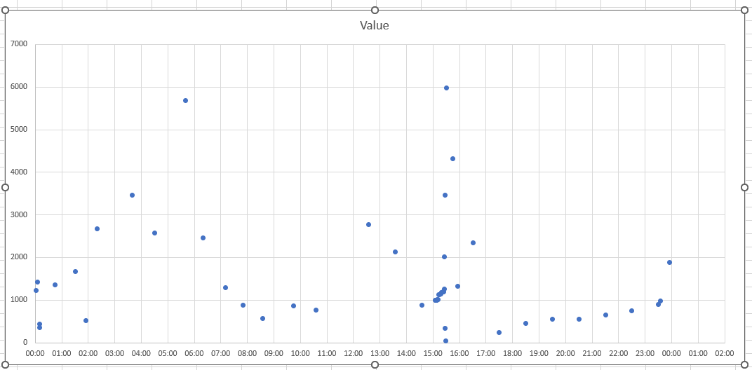
and give me that image chart above.

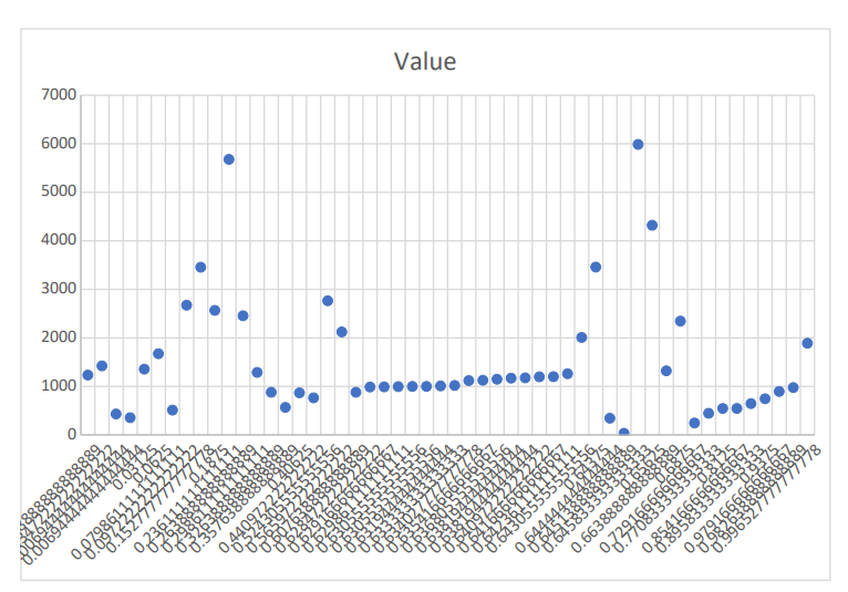
If I download it with format . xlsx I get this which is correct.

But I need it to be a pdf at the end.

Thanks
Yuza

Can you please send us the resulting XLSX file?
I’ll try to save it to PDF in order to reproduce your issue.

Where can I send you?

You can send the file via email or support ticket, see the Contact page.

As a future reference, the problem occurs because the older version of GemBox.Spreadsheet is being used. The newer versions will render that horizontal axis appropriately.

Also, another thing to note here is that in order to create a full 24-cycle on a horizontal axis, you need to use this:

scatterChart.Axes.HorizontalValue.MajorUnit = 1.0 / 24;

DateTime start = worksheet.Cells["A2"].DateTimeValue.Date;
scatterChart.Axes.HorizontalValue.Minimum = ExcelCell.ConvertDateTimeToExcelNumber(start, workbook.Use1904DateSystem);
scatterChart.Axes.HorizontalValue.Maximum = ExcelCell.ConvertDateTimeToExcelNumber(start.AddHours(24), workbook.Use1904DateSystem);

The following is the resulting PDF:

Regards,
Mario